19/20.CP.2011
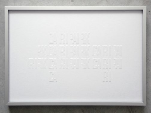
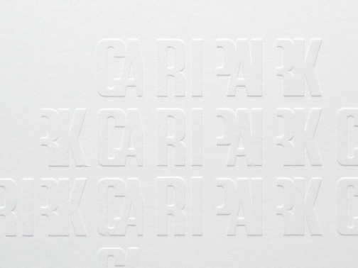
Developed as part of an ongoing study of concrete car parks in the UK, Concrete Poetry is a screen print referencing the concrete type on the façade of High Cross Car Park in Truro city centre.
Built in 1974, the building is one of a very few examples of Modern public concrete architecture in Cornwall. High Cross was designed by architect John Taylor, of Marshman, Warren, Taylor Architects who were, at the time, one of the largest architectural firms in the UK. As well as an architect, Taylor prided himself on being a graphic designer and the giant concrete lettering, ‘Car Park, Car Park, Car Park, Car Park’, on the façade of the building was designed by him. Although monumental, this piece of lettering is actually very detailed with the letters carefully designed to overlap and fit into the shape of the cast concrete blocks. Intended as the entrance for the car park, the façade would have acted as a piece of architectural ‘wayfinding’ or ‘sign-posting’, directing drivers to come and park their cars. Unfortunately the Council changed the way the road networked around the building at the last minute which inadvertently changed the entrance into the exit. Ironically, the only glimpse of the graphic façade you get is through your rear view mirror as you leave the car park.
In concrete poetry the typographical and compositional arrangement of the words is as important as the conventional elements of the poem - such as the meaning of words, the rhythm and rhyme. The effect of this arrangement adds to the meaning of the poem visually and can heighten its impact. Because of this, it is sometimes referred to as visual poetry, a term that has evolved to have distinct meaning of its own, but which shares the distinction of being poetry in which the visual elements are as important as the text.
To celebrate the concrete type at High Cross, the text of the façade has been broken up into it's concrete modules and arranged in the shape of a car, giving the letters an abstract element that is read pictorially. The white flock on white paper gives a relief image that is subtle and understated, referring back to the concrete type on the building.
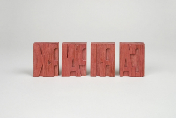
The concrete type modules have also been made in to letterpress wood blocks. The wood block are a relief pattern, made in reverse or mirror-image, so it reads the correct way round when printed. This references the view of the graphic façade seen through your rear view mirror when leaving the car park.
All rights reserved.
Copyright © Sophie Tarbuck.